Ms. Wheelchair Ohio

“Embracing diversity through advocacy, education, and leadership.”

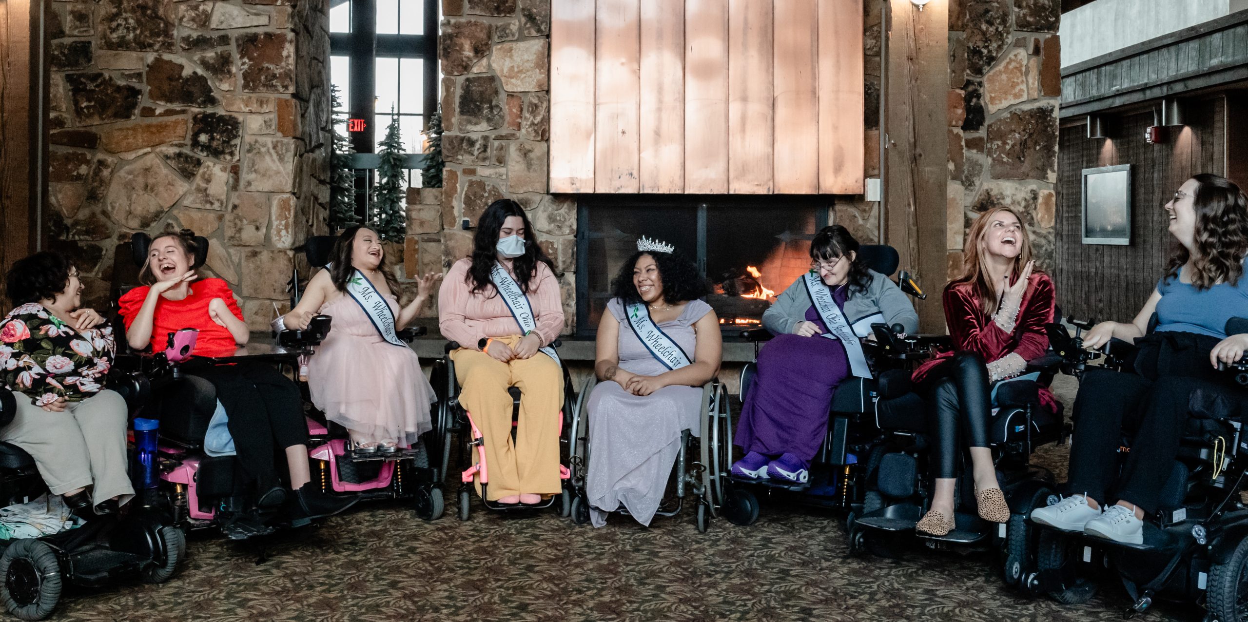
Ms. Wheelchair Ohio is an advocacy and educational nonprofit organization raising awareness about disabilities and the physical, attitudinal, and institutional barriers people with disabilities face – as well as illuminating the successes of women wheelchair users. State titleholders use this platform to share their passions with businesses, government leaders, and the general public across the state to initiate change for the disability community.

Serving as a state titleholder also provides the opportunity to participate in the national competition, where women attend educational workshops, partake in community-building activities, and compete for the title of Ms. Wheelchair America. Whether crowned as the national titleholder, a recipient of another award, or neither, the experience leads to a network of powerful women wheelchair users, unanimously called a sisterhood.

The Ms. Wheelchair Ohio logo includes a purple silhouette of the state of Ohio as the background. The text “Ms. Wheelchair Ohio” is overlaid in a stylish, black script and serif font combination. A golden crown is placed above “Ms.," and the "W" resembles a wheelchair.

Sponsored in part by

The image contains the logo of Numotion, a company specializing in mobility solutions. The logo features the brand name "Numotion" in a combination of dark blue and orange colors. The first two letters, "nu," are in dark blue, while "motion" is in orange. Below the brand name, there is a tagline in dark blue that reads:
"Mobility and independence start here.®"

The registered trademark symbol (®) appears next to both the brand name and the tagline, indicating that they are trademarked elements of the company's branding. The design conveys a sense of movement and accessibility, aligning with Numotion's mission to provide mobility solutions for people with disabilities.
The image features the **Permobil** logo, which consists of the brand name "permobil" written in a modern, rounded, lowercase font. The text is white and set against a solid blue rectangular background with rounded corners. The letter "o" in "mobil" is stylized, giving the logo a distinct and recognizable look.  

Permobil is a well-known company specializing in power wheelchairs, seating solutions, and mobility aids, catering to individuals with disabilities to enhance their independence and quality of life. The design of the logo conveys a clean, professional, and innovative brand identity.